Welcome to our newest feature here on PyroOnThePitch.com, with a series for the kit interested, by the kit interested, and containing interesting kit things (of the vintage variety of course). “Kit Interested” joins Retro Shirt Reviews, the Cold War Classic (over on MuseumOfJerseys.com) and Champagne Kit Campaigns in our regular explorations into the ‘fabric of football’, the appeal of which often results in small decreases in social media followers when certain folk realise that we are equally likely to focus on the grittier side of supporter culture history.
We wanted to stress the “interested” part (rather than all-knowing), as we are also keen to learn ourselves, as well as inform. That’s where you lot hopefully come in , as any feedback to fill us in on what we may not know is very welcome.

Tottenham Hotspur vs Chelsea, 26/08/1978:
A common complaint of many modern kit-fanatics is that of away and third strips being used in fixtures where they were historically not necessary, mainly – it is assumed – due to marketing reasons (often correctly so). At best, this is considered a callous disregard for the team’s proud traditional colours and at worst can actually create somewhat of a clash where none had existed before (Sheffield Wednesday vs Arsenal in 2015 being a prime example, graciously provided by MuseumOfJerseys since the modern game is not really our era of expertise).
Like many aspects of football, however, the tradition of seemingly inexplicable changes stretches back far longer than many might imagine – at least to 1978 when Tottenham Hotspur took on Chelsea in a Division One match. The white shirts of Spurs against the blue of their London rivals never caused an issue of course, but the navy shorts of the former against Chelsea’s continued blue, along with both sides’ white socks, did create a “lower-half clash”.
This had been negated in various ways in the past, such as the 1967 FA Cup final in which full blocks of white and blue were worn – one of three times Chelsea used the combination that season:

In the 70s, Chelsea then had the innovative idea to introduce an “alternate first-choice kit” to be worn against teams who had white socks, in which amber socks were used (distinct from the yellow socks of the yellow and blue away kit). But delightfully, instead of simply pairing the alternates with the rest strip, these were accompanied by shirts and shorts featuring amber trim, replacing all white from the regular kit (seen here against Real Madrid in the 1971 Cup Winners’ Cup final):

Tottenham took a similar approach when playing away in Stamford Bridge for the 71/72 League Cup semi-final 1st-leg, by donning white shirts, white shorts, and yellow socks. In doing so, they also removed the shorts clash, although this was less-concerning than the socks which covered an area more in-need of distinction for officials:

When Chelsea traveled to White Hart Lane at the end of the 74/75 season – for a game that would ultimately see them relegated to the Second Division – another set of alternate home socks were used; this time blue like the rest of the kit, but featuring predominantly red trim:

The socks were slightly odd, as the red used now was a reference to the away version, which had green in place of the blue as the primary colour but contained the same red/white ratio on the turnovers. This trim was to compliment the red shirts and white shorts of the away kit, but the colour was only to be found on a sliver of the crest as far as the regular first-choice elements went at the time.
Following a season back in an all-yellow away kit (with blue detailing), Chelsea combined their recent change-colourways by bringing in a yellow/green/yellow strip for 1978/79, with Umbro sleeve-taping retained from it’s debut the year before. Now back in Division One, the campaign started with the previous season’s home attire employed against Everton at the Bridge, and away to Wolves.
But for any internet kit nerds of the day, all eyes would be on the Tottenham vs Chelsea derby coming up next to see how the sock issue would be handled this time. When the teams emerged, traditionalist Chelsea fans who made the short journey over may have been upset to see their side in an away kit for, perhaps, the first time ever at White Hart Lane:
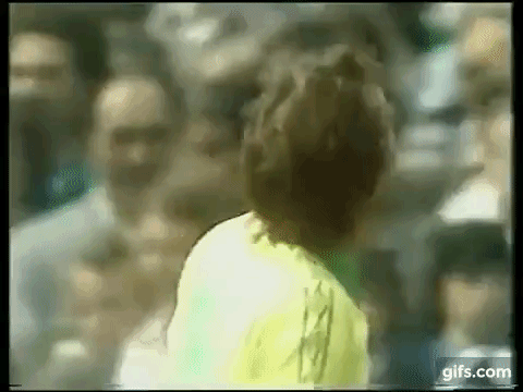

Without home-alternates this year, the idea of blue and white shirts and shorts with yellow and green socks may have been out of the question even for Chelsea, who had questionably (in a fashion sense) combined their home shorts with the red and green away kit at Millwall in 1977:

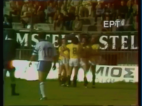
While the change may have seemed utterly illogical to some, it seems that using the full away kit was considered the easiest option to avoid any sort of clash entirely. Except to a significant portion of the audience watching highlights at home on TV, a new clash was very much in effect that was far worse than anything seen in the fixture before.
Commentator Brian Moore explains as the match kicks off:
And it’s Chelsea in a change strip of yellow shirts and green shorts, and yellow socks, who are attacking the goal to our right… We apologise if there’s something of a clash if you’re watching in black and white, Spurs in the slightly darker shorts and the slightly whiter shirts.
Maybe the amount of viewers effected was already negligible (we’d love to see some records for colour vs black and white TV licenses in the UK in 1978), but clearly there had been a significant oversight. For those who tuned in to watch on an older/cheaper set, we can see from converting a suitable screen shot to black and white that “something of a clash” was an understatement:

While it may have been unfair on some, the only eyes that really mattered were the ones witnessing and participating in the game live in colour, and to the players, officials and fans, there was a clear, if unusual, distinction. It would have been interesting to see if any of those in attendance that day were savvy enough to cop the potential problem the kit configuration would have without colour, and in fact many doubtlessly did realise when watching the game later on The Big Match.
Over the coming years, the black and white clash became less and less of an issue as technology advanced and prices of colour televisions lowered (although, surprisingly, 12,000 black and white TVs remained licensed in the UK as of 2014). But on a global scale, with the world’s varying degrees of ‘development’, the clash remained an important factor for FIFA and contributed to the the strict distinctions demanded (resulting in some memorable mash-ups) in World Cup matches for years to come.
*
Greece vs Australia, 11/11/1980:
One kit trope that we love here at POTP, is when a team who aren’t usually known for it wear white shorts with their otherwise usual home colours. Two classic examples stem from the 1978 World Cup, when both Brazil and Spain (see last link above) were forced to swap their blue shorts for white due to clashes against Argentina and Sweden respectively.
In a similar way, we are also big fans of strips consisting of ‘colour/darker colour/white’ in terms of the shirt/shorts/socks. Australia sported this look to great effect at their debut World Cup in 1974 with yellow/green/white (seen vs West Germany below), while more notably wearing one of the most bizarre shirts of all time due to the fact that the double diamond of Umbro on the chest was accompanied by the three stripes of Adidas on the sleeves:

Several years later, Australia (now “fully-Umbro’d”) traveled to play Greece in November 1980, as part of a European tour that also included a game against England at St. Andrews, before a ‘club vs country’ affair with Leicester City. While the English match would be the main event, the Greeks themselves had just come off their first ever major tournament appearance at Euro 80, which they had followed with 0-1 World Cup qualifier defeat to Denmark.
As of that year, the “Socceroos” were still using their yellow/green/white format, as seen in another match against the English back in May (an Australian football centenary game in Sydney). But for the Greek encounter on November 11th in Athens, Australia reversed the shorts and socks colours to create a yellow/white/green strip, much to our satisfaction:

While not as crazy as the 1974 jersey, the Australian shirt by this time was still pleasingly odd in a perfectly Ozzie way. In the late 70s, Umbro had introduced a wordmark under their diamond logo, including on Australian kits. But uniquely (?) for the 80-82 iteration, the “umbro” now appeared on one side of the centralised crest, and the double diamond on the other.
The host side, meanwhile, were in their change strip of white/blue/white, which had actually been used with black shorts at the Euros. The logo of ASICS can just about be seen…:

…but an advertising hoarding with the same logo displays the word “Tiger”:

This is because the company had originally started life in 1949 as the Japanese footware-firm ‘Onitsuka Tiger’ and had only rebranded to ASICS (an acronym for the Latin “anima sana in corpore sano” – “healthy soul in a healthy body”) in 1977, with the logo having first appeared on running shoes back in 1966. The ‘Tiger’ theme is still used by ASICS to this day when it comes to trainers, but evidentially it might also have applied to their tentative first steps into the football kit world in the early 80s.
Breaking down the kit choices side by side, it seems plausible that the reason for the Greeks not to wear their home blue shirts may have been because the Australian ‘keeper was also wearing blue (see below), and so the away shorts and socks were also used. Then, even though sock clashes wouldn’t have been considered a pressing issue in friendlies, the Australians changed to their alternative white shorts and green socks, perhaps to account for the aforementioned “black and white clash” which would have occurred on certain TVs (presumably a greater issue in poorer Greece than it was in the UK in 1978).

After a 3-3 draw, the boys from Down Under moved on to Britain for their match against an English side who, like Greece, would be in white/blue/white. Unlike with the Greeks though, this was England’s expectant first strip so perhaps yellow/white/green had been the Australians plan for the tour all along.
Unfortunately, there doesn’t seem to be any visual evidence for the England game or what was worn. But this brilliant website does display an Australia away jersey that was apparently used against Leicester a few day later, suggesting that two full kits were more than likely brought with each element used as needed. Or was there just two jerseys?
*
Portugal, 1990/91
We have one more example of white shorts being surprisingly inserted into an established national kit, but this time it would not be a forced mash-up – rather, a conscious change of style direction. The country in question is Portugal, who may have took inspiration from their Iberian cousins change at World Cup 78 and decided they wanted the look for themselves…twelve years later.
As we saw in the recently published Euro 84 Football Special Report, the Portuguese were an Adidas side had who worn the stunning diagonal-pinstripe “Chelsea” template at the tournament. By the end of 1989, Portugal were playing out their fruitless World Cup 90 qualifiers in the usual red/green/red home colours, now with a with a greater presence of white on a shirt that featured dual sleeve ‘flashes’ (seen below away to Brazil in a friendly), and an all-white away kit that kept the same jersey template in reverse, but with different-style shorts (seen away to Switzerland in a qualifier):

After a 0-0 draw away to Czechoslovakia in the change kit on November 15th, 1989, Portugal would not take to the field again until August 29th, 1990, when they would host now-World Champions West Germany in Lisbon for a friendly. A 1-1 draw was played out, but the 20,000 in attendance at the Estádio da Luz were lucky enough to witness the home side’s new change in kit direction:

The jersey from 1989 remained but the green shorts were gone, now replaced by a rarely seen design in white with red details to better matched the shirt. The “missing” green was transferred downwards, however, to the socks (with white Adidas branding), where red lost out:

The kit made it’s competitive debut away to Finland in a Euro 92 qualifier the following month, before a visit of the Dutch to Porto for another qualifier on October 17th, 1990. With the away side in white/orange/white, both teams engaged in dual Adidas ‘jacket-porn’ before the match with two outstanding anthem-tracksuit tops on show (some of which didn’t have a crest on the Portuguese side):

A friendly in January 1990 away to Spain provided the answer to a question on everybody’s minds: which shorts would be used with the away shirt? As mentioned, the white shirt that had been around since at least 89 had been used with it’s own pair of shorts originally, when the home pair were green. But with the new shorts seemingly matched specifically with the shirt template (which was the same for home and away), it makes sense that 1990 shorts were indeed retained:
These configurations were used in qualifiers in February against Greece, Malta (away) and Malta (home). But come the Autumn, for the return tie against the Finns (see below; and possibly a preceding friendly against Austria), a new kit was introduced that revived the old red/green/red system. A friendly away to Luxembourg in October, in which a new white/green/white away kit was used, confirmed that this experimental era was over:

*
Porto vs Werder Bremen, 24/11/1993
Ditching the white shorts theme, but very much continuing with the Portuguese theme, Portugal are well known around these parts for their continued use of an Adidas trefoil shirt as late as December 1994 (seen below vs Lichtenstein, December 94; the same template that had debuted in it’s away version against Luxembourg in 91). This seems shockingly out of date when some nations, such as Ireland, were on their third generation of shirt past the trefoil (Equipment; World Cup 94; Umbro), and were most likely the last ‘major nation’ to do so (at least in Europe).

It seems that at club level, things weren’t TOO different either, as demonstrated by 92/93 Primeira Divisão champions Porto in their Champions League campaign of the following season. Also with Adidas, Porto started the competition wearing a ‘trefoiled- kit’ that used the same shorts-template as Portugal 90/91 (see above), as used against Feyenoord in the second round…:

…before moving onto a strange new shirt featuring just an ‘adidas’ wordmark, but with a miniature variation of the “Equipment” logo incorporated into the collar, as seen against Milan:

The away and third kits that year, however, were full on Adidas Equipment – the “post-World Cup qualifers style” that added corresponding lower sections the diagonal shoulder bars. While most sides used this template with a primary background colour and secondary bar colour, Porto ingeniously only coloured the outlines of the bars, effectively creating all-white and all-blue strips that wouldn’t cause an issue against the blue or white clad team that had triggered the switch in the first place.
Considering that, the situation that would occur when Werder Bremen arrived for that year’s Champions League group stage (which only came after a first and second round and led directly to semi-finals) was most peculiar. The main issue was that the Germans had seemingly only brought their home strip of white/green/white, which wouldn’t do against the white and blue stripes of the home team:

Perhaps the blue version of the bars template was not yet produced by this stage, but needing some sort of alternate attire Porto emerged in a top that was presumably a change shirt from the season before. It appeared to be the Adidas Equipment template used the likes of Spain and France that featured a total of six bars across the two shoulders, but, unlike those, the Porto version incredibly displayed a trefoil in the collar (which was also white, unlike the other versions) instead of the “triangle” (or, eventually, a lone wordmark in the case of the French, meaning that this template had seen all three Adidas logo varieties):

The unusual jersey proved good luck, whatever the case, as a 3-2 victory was secured while wearing it (or Porto were just better). A few months later in March 1994, when Anderlecht were the Portuguese champs’ opponents in the same group, again white was worn by the visitors. But by now, the “correct”, up-to-date shirt was available, and Porto played and won – en route to making it to the quarter-finals – in the same template as their opponents:

Funnily enough, the only consistent feature throughout was those old 1990-shorts from the home kit, which had been retained in the first-choice strip when the trefoil shirt was dropped. This meant that during Porto’s 93/94 season, the shorts had somehow ended-up paired with at least four different jerseys that they had never intended to be used with.
*
Finally, for this bumper first of edition of Kit Interested, we turn to the Republic of Ireland, who’s 1992-1994 Adidas strips were recently highlighted in Campaign Kit Campaigns #4 and #5. In the latter of these, it was mentioned that after two World Cups the Irish had yet to lose a WC finals match in their home shirt, and equally yet to win a WC finals match in their away shirt.
After switching to Umbro following the USA edition, amazingly the Boys in Green’s only other World Cup appearance to date at Japan/Korea 2002 produced the same result after four matches. We thought a sort-of handy graph/timeline was in order show how this phenomenon of the “cursed away” jersey unfolded:

*
YouTube Links:
Chelsea vs Tottenham Hotspur, 1967
Real Madrid vs Chelsea, 1971
Chelsea vs Tottenham Hotspur, 1972
Tottenham Hotspur vs Chelsea, 1975
Tottenham Hotspur vs Chelsea, 1978
Millwall vs Chelsea, 1977
West Germany vs Australia, 1974
Greece vs Australia, 1980
Brazil vs Portugal, 1989
Switzerland vs Portugal, 1989
Portugal vs Germany, 1990
Portugal vs Netherlands, 1990
Spain vs Portugal, 1991
Portugal vs Finland, 1991
Luxembourg vs Portugal, 1991
Portugal vs Lichtenstein, 1994
Porto vs Feyenoord, 1993
Porto vs Milan, 1994
Porto vs Werder Bremen, 1993
Porto vs Anderlecht, 1994
Ireland vs England, 1990
Ireland vs Egypt, 1990
Ireland vs Netherlands, 1990
Ireland vs Romania, 1990
Ireland vs Italy, 1990
Ireland vs Italy, 1994
Ireland vs Mexico, 1994
Ireland vs Norway, 1994
Ireland vs Netherlands, 1994
Ireland vs Cameroon, 2002
Ireland vs Germany, 2002
Ireland vs Saudi Arabia, 2002
Ireland vs Saudi Arabia, 2002

*****

[…] Welcome to issue #2 of Kit Interested, a sort of virtual mini-magazine taking a look at interesting kit situations that we think are worth sharing. Click here if you missed the bumper debut installment, where we began with a look at a Spurs-Chelse…. […]
LikeLike